Infographic of the TCP/IP network model


The TCP/IP network model is a fundamental framework for understanding how data is transmitted over the internet. It consists of several layers, each serving a specific purpose in the process of communication across networks. Infographics can provide a clear visual representation of these layers, making it easier to comprehend their functions and interactions. Here are some notable infographics depicting the TCP/IP network model:
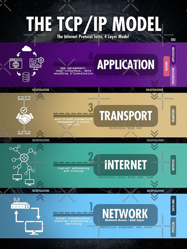
1. Basic Overview of the TCP/IP Model
This infographic outlines the four layers of the TCP/IP model:
- Application Layer: This layer includes protocols used by software applications to communicate over the network, such as HTTP, FTP, and SMTP.
- Transport Layer: Responsible for end-to-end communication and error recovery, featuring protocols like TCP (Transmission Control Protocol) and UDP (User Datagram Protocol).
- Internet Layer: This layer handles the movement of packets across networks using IP (Internet Protocol).
- Network Interface Layer: The lowest layer that concerns the physical transmission of data over network devices, including Ethernet protocols.
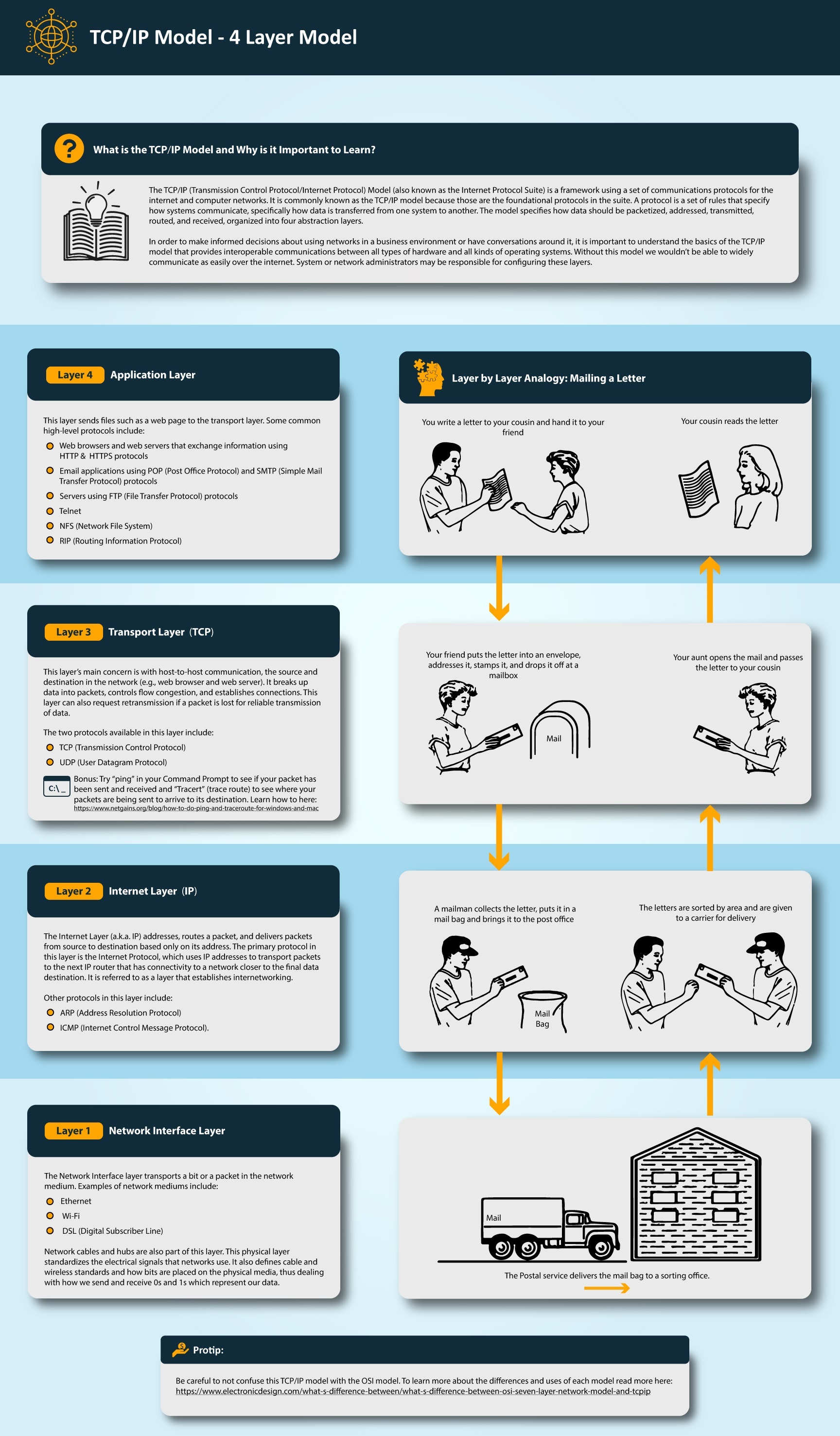
Overview of the TCP/IP model, displaying its four essential layers (Source: CS330)
2. Detailed TCP/IP Model Layers
Another illustrative resource provides a more detailed look at each layer, helping to visualize how they interact with real-world applications:
- Application Layer: Programs and services users interact with directly.
- Transport Layer: Manages the transmission of data between hosts, ensuring integrity through various protocols.
- Internet Layer: Facilitates routing of data throughout the network.
- Network Interface Layer: Bridges the connection between the internet and local networks.
Detailed illustration of the TCP/IP model layers (Source: Network Walks)
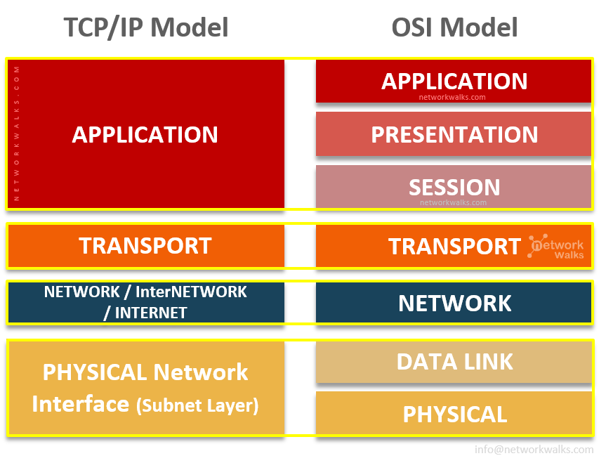
3. Comparisons With Other Models
Some infographics also contrast the TCP/IP model with the OSI (Open Systems Interconnection) model, highlighting similarities and differences:
- The OSI model consists of seven layers, while the TCP/IP model simplifies this into four.
- For example, the TCP/IP model combines the presentation and session layers into the application layer.

Comparison infographic of TCP/IP and OSI models showing structural differences (Source: Technical Hakim)
Conclusion
Infographics provide a simplified yet effective way to understand the complexities of the TCP/IP model. They visually represent the model's layers and help clarify how data flows through networks. Whether for educational purposes or professional development, these visual tools serve as a valuable resource for anyone studying network protocols or architecture. For further exploration, various infographics are available online that can deepen your understanding of each layer and its functions.